January 3, 2019 | Sandy Giardi
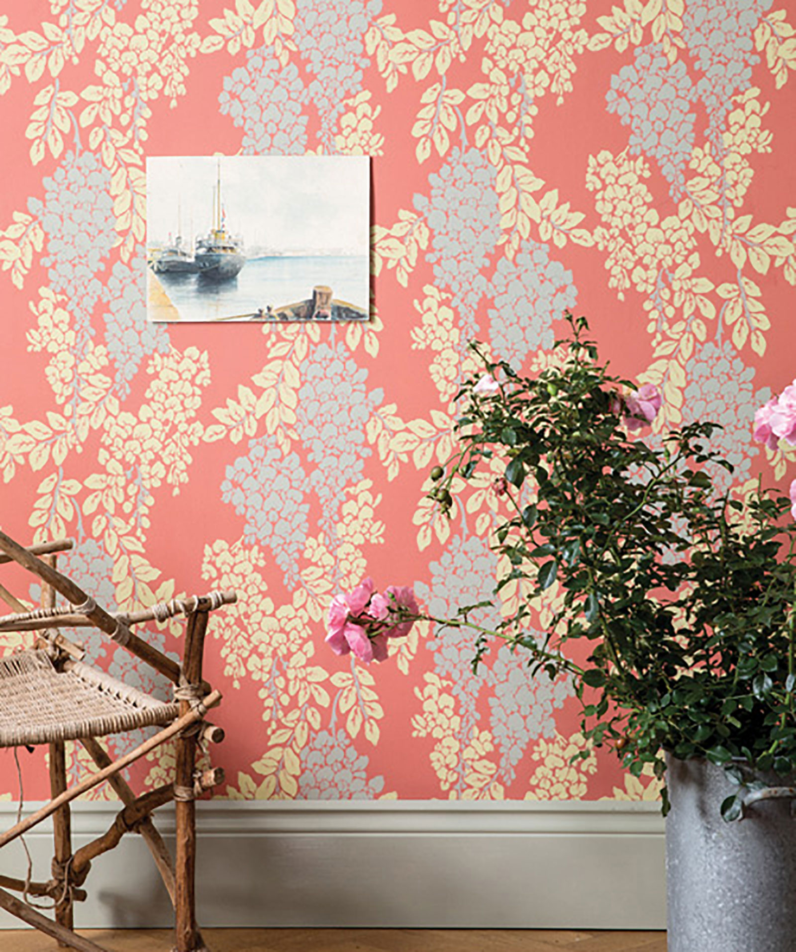
Every year, the Pantone Color Institute rolls out a vibrant and nuanced shade that taps into the current collective mood and spirit of the populace. The hue is determined by the Institute’s experts, who comb the world over for trends and color influences.
For 2019, they’ve given the honor to Pantone’s 16-1546 Living Coral, a vital, immersive hue that is rooted in nature and yet friendly and sociable enough to be keyed into this digital age. Pantone calls the color “an animating and life-affirming coral hue with a golden undertone that energizes and enlivens with a softer edge.” We call it gorgeous.
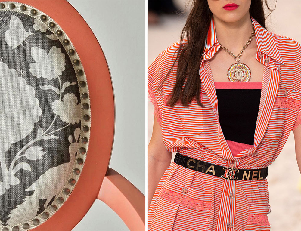
Left: The Parisienne armchair, designed by principal Barbara Hirsch of Elza B. Design, Inc. for Dowel Furniture, mixes coral with an upholstered print. Right: A bright frock by Chanel channels the tone in its Spring 2019 collection.
Pantone’s color of the year historically impacts the development and decisions by tastemakers in the home and furnishings world, in fashion, and in all areas of design. We’ve already spotted the cheerful color, however, in the projects of pros that are clearly ahead of the curve....
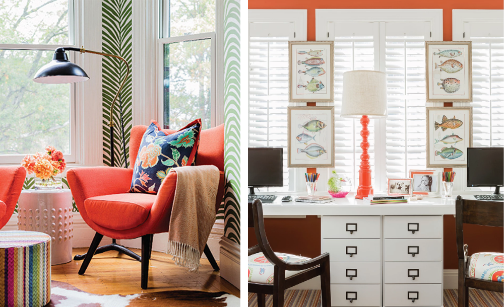
Pops of coral enliven a sitting area and an office in two looks by Elizabeth Home Design & Decor; photography by Michael J. Lee Photography
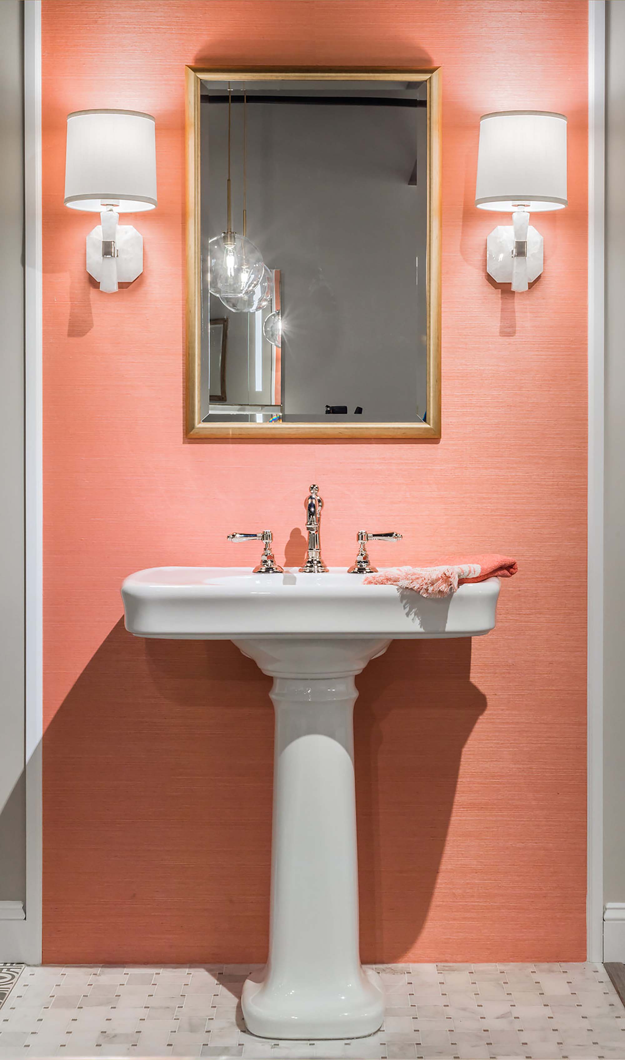
A refreshing and feel-good powder room featuring a pedestal sink and the fixtures of Snow and Jones, Inc.
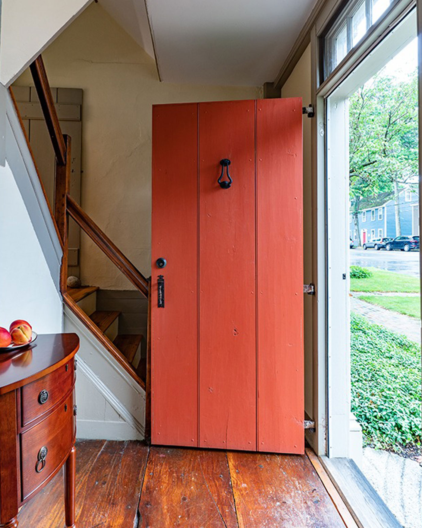
The coral door of a historic home designed by Cummings Architects swings open in a warm welcome.
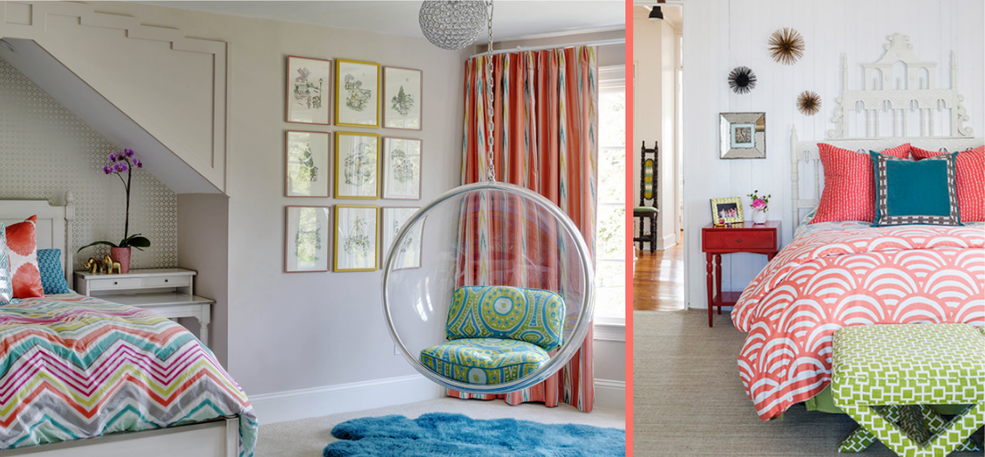
Heather Vaughan Interior Design weaves in the hue in two distinctive and bold bedroom designs.
Main image: Wisteria wallpaper by Farrow & Ball, available at Wayland Home & Design


Add new comment