
April 13, 2015 | Anonymous

(Architecture by A. Tesa Architecture)
Pantone’s recently released Spring Color Report is showing an affinity for the softer, more natural shades on the color wheel. We’re talking Toasted Almond, Custard, Lavender, and Strawberry Ice, among others. Mixed in with these soft hues are some brights—Scuba Blue, Tangerine, and Lucite Green, for example, are colors that pop against the softer, more natural shades.
Executive Director Leatrice Eiseman describes the collection of colors as “ethereal, nature-like neutrals” that evoke “retro delights, folkloric and floral art, and the magical worlds of tropical landscapes that restore a sense of well-being as we head into warmer months.”
Wonderfully said. We look at this collection of colors and see the promise of summer, of time spent lazing on the patio in the warm afternoon sun, of bright days at the beach, and balmy, carefree nights.
Below, we’ve rounded up some of our favorite work by architects, interior designers, and builders that we feel best represent and display these gorgeous summer shades.
We'll start with Toasted Almond, a shade that brings natural warmth to the Spring 2015 palette. Balancing cooler shades, Toasted Almond brings a nutty and natural feel, and looks as classic in fashion as it does in the home. In this dining space, a take on the Toasted Almond shade complements a stunning waterfront view. The earthy wood accents and floor keep this space grounded, while the large windows fill it with bright natural light.
Strawberry Ice is this spring's answer to a classic pink. This shade is both refreshing and warming, evoking young spring blooms and blossoms.
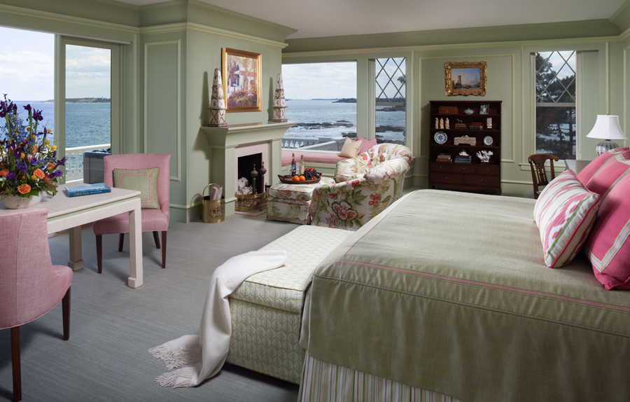
Interior Design by Cebula Design
Yellow is basically a staple in spring and summer color palettes, but this version of the sunny shade is decidedly different. Custard is a little bit mellower than everyday yellow, but still brings with it light warmth and feelings of contentment.
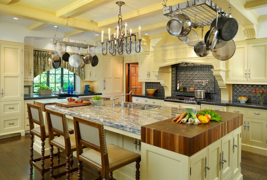
Kitchen by Architectural Kitchens
Taking things up a notch, Tangerine is a bold shade of orange that is just soft enough for the interior of your home. Infuse your space with energy and fun with this bright tangy hue.
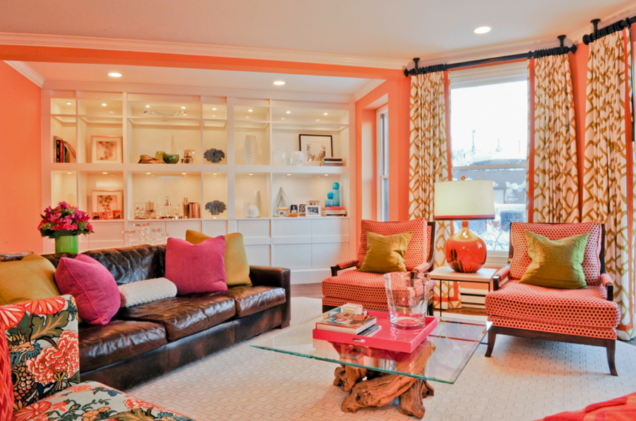
Interior Design by Dietz & Associates
On the cooler side of the spectrum, Dusk Blue is a classic shade that can be adapted for any room in the house. This quiet, calming shade is perfect for bedrooms and bathrooms, where serenity is key.
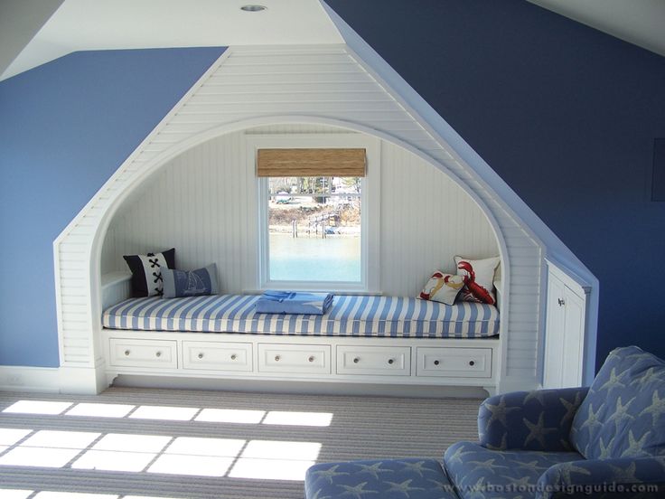
Built by E.W. Tarca Construction
Lavender Herb is a shade that brings your garden indoors, creating a peaceful atmosphere that's also rich in color. Lavender can be lightened into a pastel, as below, or deepened for a bolder effect.
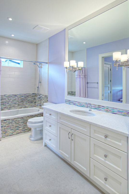
Bathroom by Rockwood Custom Homes
Woodbine is a natural yellow-green shade inspired by leafy foliage. A shade forever associated with spring's fertility, this shade goes with just about anything, and can be used anywhere in the home for a rejuvenating breath of fresh air.
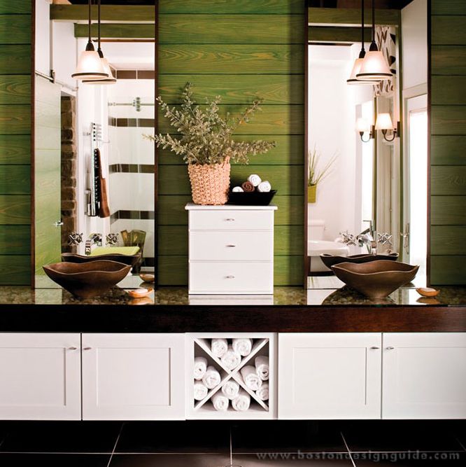
Bathroom by The Kitchen Works
Lucite Green is the candy-coated version of classic green. Imbued with brightness and vibrancy, this hue is above all playful, and can bring an unexpected bit of fun to your space.
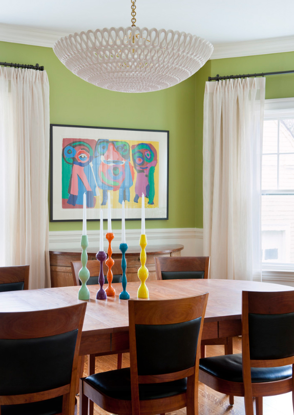
Interior Design by LDa Architecture & Interiors
Of course, the Pantone Spring Color Report would not be complete without this year's bold Color of the Year Marsala. Marsala is a grounding shade that can easily be paired with either bold brights or stabilizing neutrals. Here, we see Marsala serve as the basis of this interior space on the stair runner carpet, bringing warmth to an otherwise mostly-white space, and serving as a transition from the dark hardwood floor to the beige and white walls and moldings.
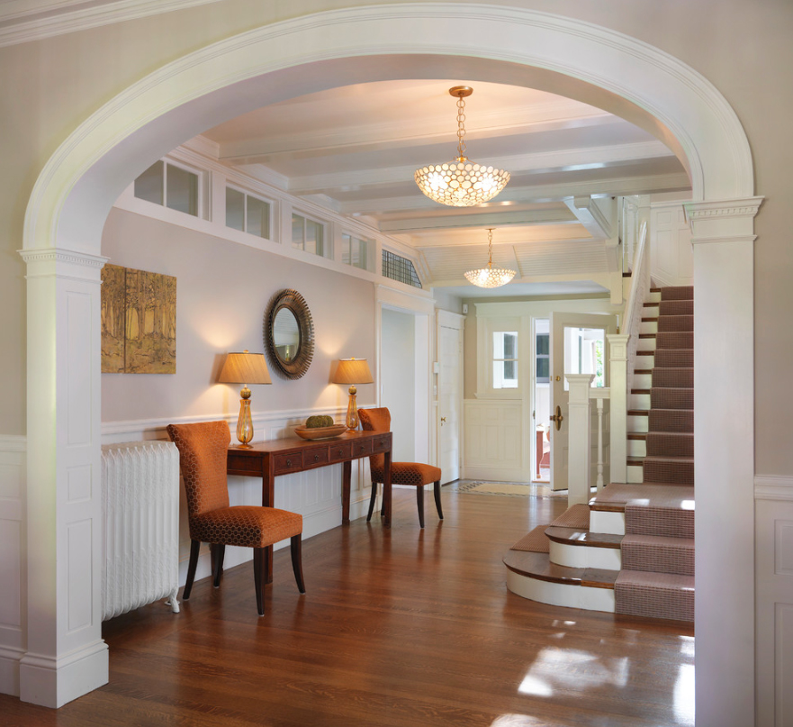
Construction by S + H Construction
Source: Pantone Spring Color Report 2015
Add new comment