November 5, 2018 | Sandy Giardi

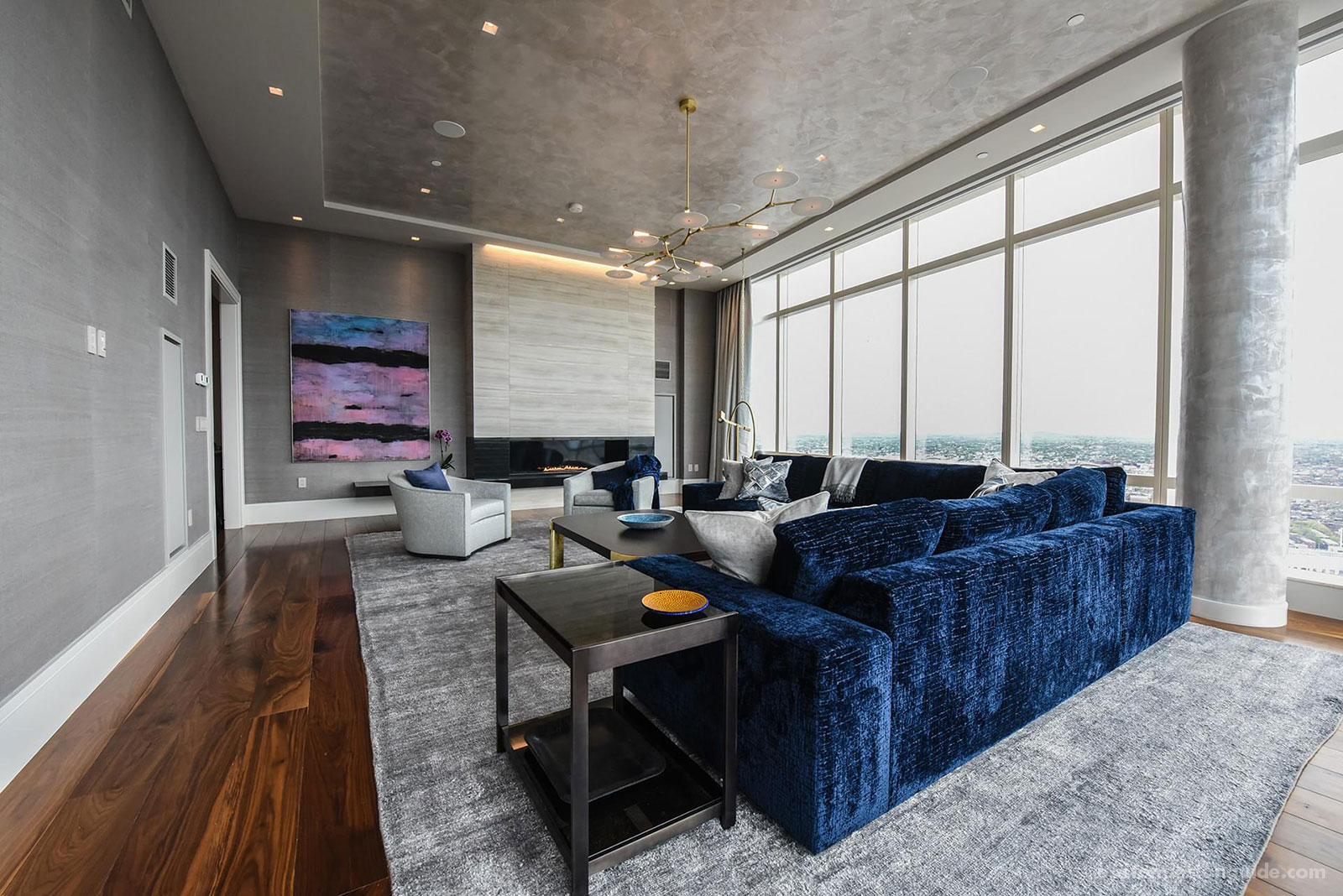
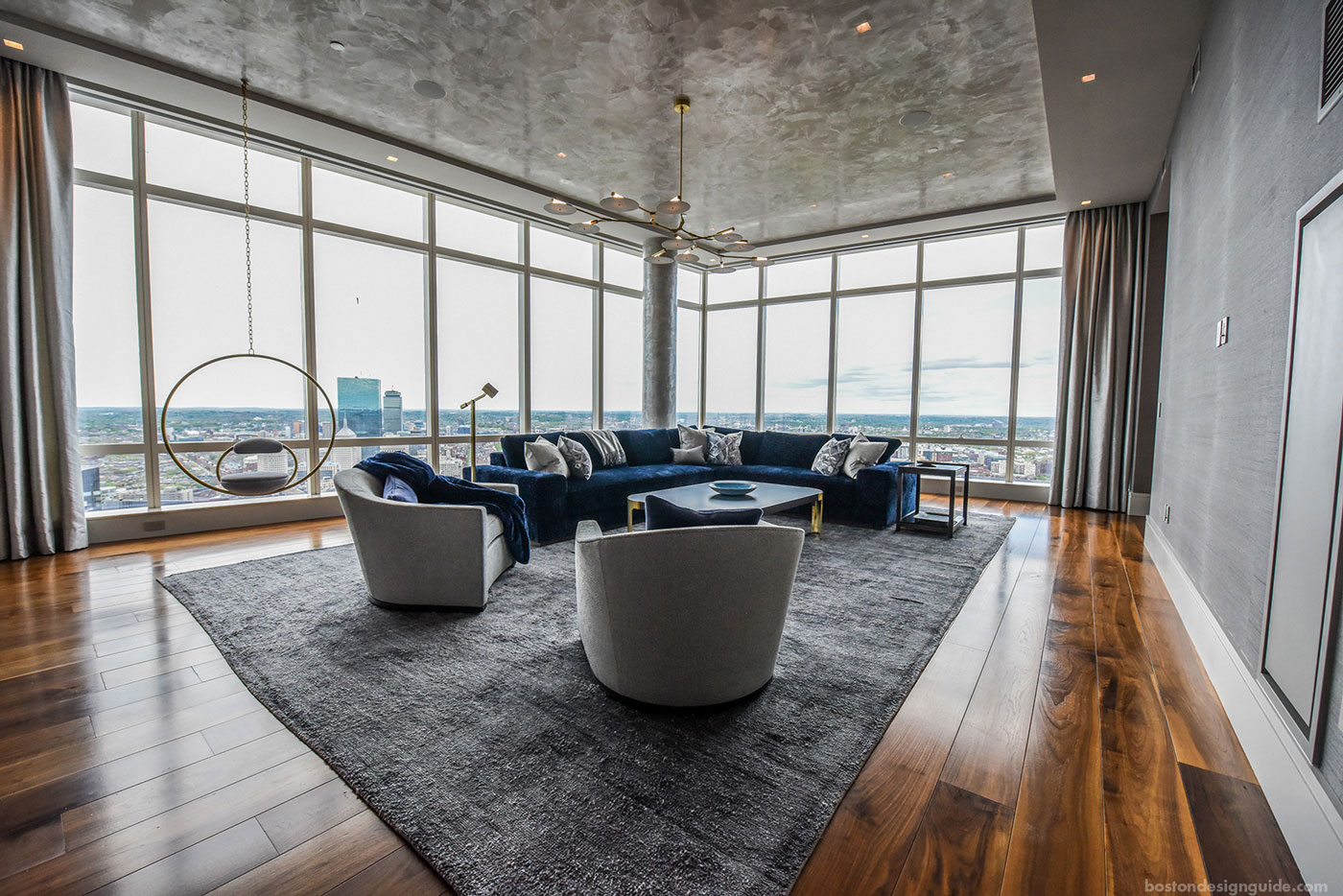
When Sleeping Dog Properties, Inc. worked with Elms Interior Design to reimagine this luxury condo at Boston’s Millennium Tower, a dynamic navy blue figured in greatly to the design mix. In this expansive, sky-high space, with the city at its feet, this accent color was a natural choice, complementing the tones of the panoramic views found outside a perimeter of floor-to-ceiling windows.
Blue has long had a gallant and regal feel, no doubt, says the team at Sleeping Dog Properties, Inc., from the color’s long association with the crisp uniforms of British Royal Navy officers, and its inherent nautical feel. Plus, the hue is softer and more welcoming than black, and has an endless spectrum of shades that designers can work from.

While some may argue that darker hues in interior design might read as confining, the airy feel of this luxury residence would indicate otherwise. “We’re involved in a lot of the custom home projects in and around Boston,” shares owner Christopher Rapczynski of Sleeping Dog Properties, Inc. “and we’re seeing our clients and design partners incorporate navy into projects in creative and powerful ways.”

The effect of navy in this contemporary condo is a case in point. Here, the stunning hue serves a dual purpose; by day, the shade draws the eye to key features highlighted within the room, while, at night, it does a bit of a disappearing act, “to allow the lights and city views to take center stage,” says the firm.

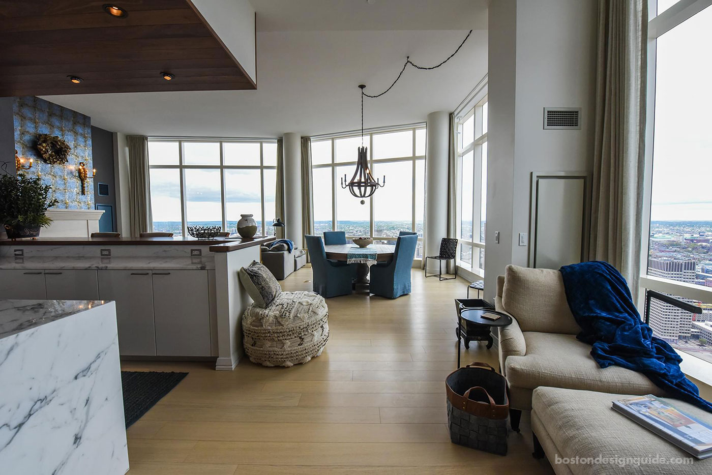
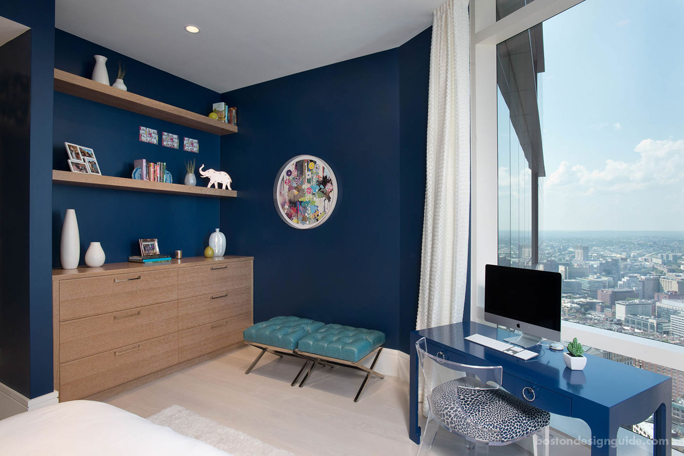
The color is run as a thread throughout the home, “creating visual consistency,” and used both in a saturated fashion and as an accent. In the kitchen, midnight marbling is woven into the counter, while, in a bedroom (shown above), an ink-blue wall makes a statement alongside crisp white accessories.
Rich blue also creates an impactful backdrop for a room’s headlining features and furnishings that a paler shade couldn’t achieve. Offers the team, “Navy creates a gorgeous contrast with the cerused finish oak cabinets and floating shelves, drawing out these unique elements that would otherwise blend in to a lighter background.”


Add new comment